Visual Finance Comparison: Apple and Microsoft

Eliza Helweg-Larsen
Published Date
Q: What’s the difference between Apple and Microsoft?
A: Apple takes more money while Microsoft makes more money.
→ Apple's sale revenues are about 2/3 higher than Microsoft's, so they ‘take’ more money.
→ Microsoft’s Return on Sales is 50% higher than Apple, so they ‘make’ more money.
You can’t say which business model is better. But in Visual Finance, you can see how each one works.
What happens when you compare Apple and Microsoft not by headlines or earnings calls, but by looking at their financial statements? Visual Finance reveals how two successful tech giants take fundamentally different paths to profitability.
🔍 Step 1: Side-by-Side Comparison
Start by setting both companies to the same stack scale in Visual Finance (e.g., 1 stack = $10 billion). This lets you compare size rather than structure.
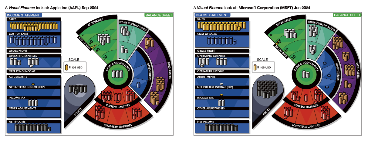
(Note: You can see larger images in the Visual Finance Viewer.)
Income Statement differences
- Revenue: Apple reports significantly higher sales than Microsoft - about 60%
- COGS: Apple has much higher Cost of Goods Sold in absolute terms—this is unsurprising for a company built on physical products.
- Operating Expenses: The SG&A expenses are similar for the two companies, but Microsoft spends more on R&D.
- Taxes: Apple pays more in taxes.
- Profit: The two companies have approximately the same profit.
Balance Sheet differences:
- Apple has more long-term investments, more debt, and significantly higher payables.
- Microsoft carries more short-term investments, more PPE, and more intangibles and goodwill. (Apple tends to develop in-house; Microsoft often acquires.)
- Apple also has a shorter Days Sales Outstanding (DSO): 62 days vs. 84 for Microsoft.
This view paints a picture of a hardware-driven, high-velocity operation (Apple) versus a service-driven, lower-volume but high-margin model (Microsoft).
🔍 Step 2: Adjust the Scale — Compare Structure
To understand proportions, set the companies so they show similar levels of Sales Revenue in gold stacks.
- Set Apple’s scale to 1 stack = $20 billion (just under two full rows of sales stacks).
- Microsoft is already at the appropriate scale, so no change is needed.
.png)
What you see now is about structure:
- Net Income: Microsoft’s slice takes up more space—a larger share of revenue.
- COGS: Apple’s is visibly higher—lower margin, higher throughput.
- SG&A and R&D: Proportionally larger for Microsoft.

Check the Ratios to confirm:
- Return on Sales: 34% Microsoft, 24% Apple
- Asset Turnover: 1.07 Apple, 0.51 Microsoft
- Return on Assets: 26% Apple, 18% Microsoft
Apple earns more per dollar of assets. Microsoft earns more per dollar of revenue. And both do it well.
The Takeaway
Apple and Microsoft are both high-performing companies, but their strategies show up clearly when viewed proportionally. Visual Finance lets you see those choices in seconds.
- Microsoft earns more profit per sale.
- Apple earns more profit per dollar of assets.
You can’t say which business model is better. But in Visual Finance, you can see how each one works.
Want to try this comparison for yourself? Check out our Continue the Learning exercise.
You can also see these and other companies in the Visual Finance App. If you don’t have an account, it’s easy to set one up.